The challenge
How do you make a waffle feel like luxury? Everyone already knows what one tastes like, and nobody expects much ceremony around it. L’Iron is a contemporary waffle house that brings French savoir-faire to waffles, coffee and everyday rituals.
Luxury usually gets there by adding more. L’Iron had to do the opposite, because its people love simple things done exceptionally well and can tell when a brand is trying too hard. The restraint had to feel warm, or a waffle would just look expensive.
The idea
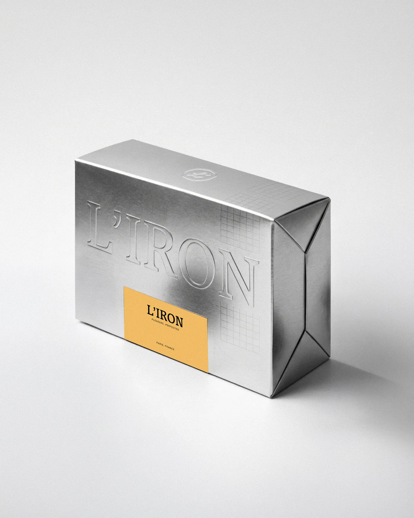
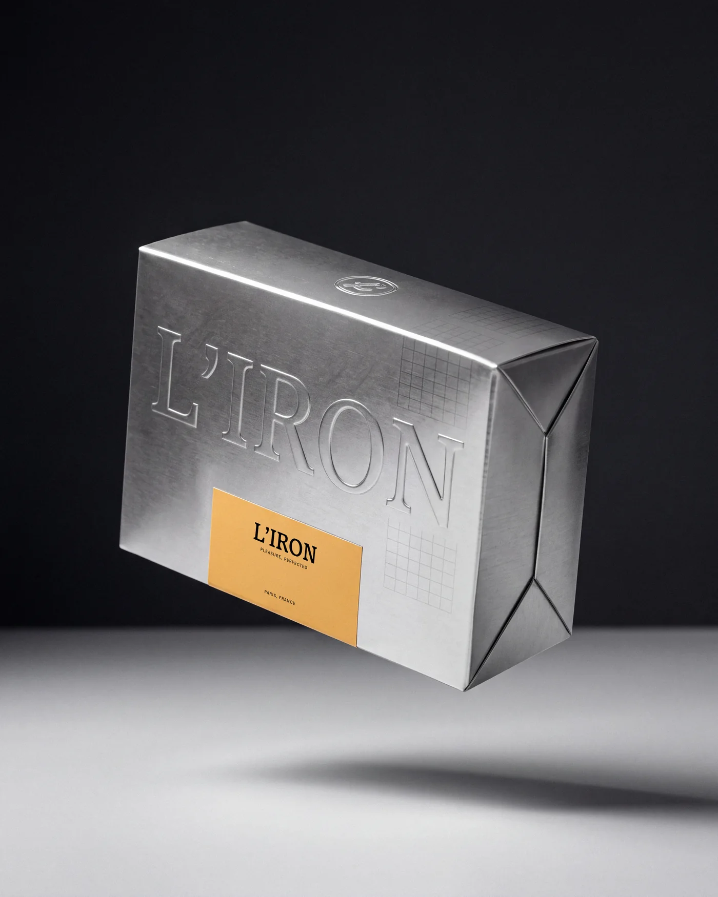
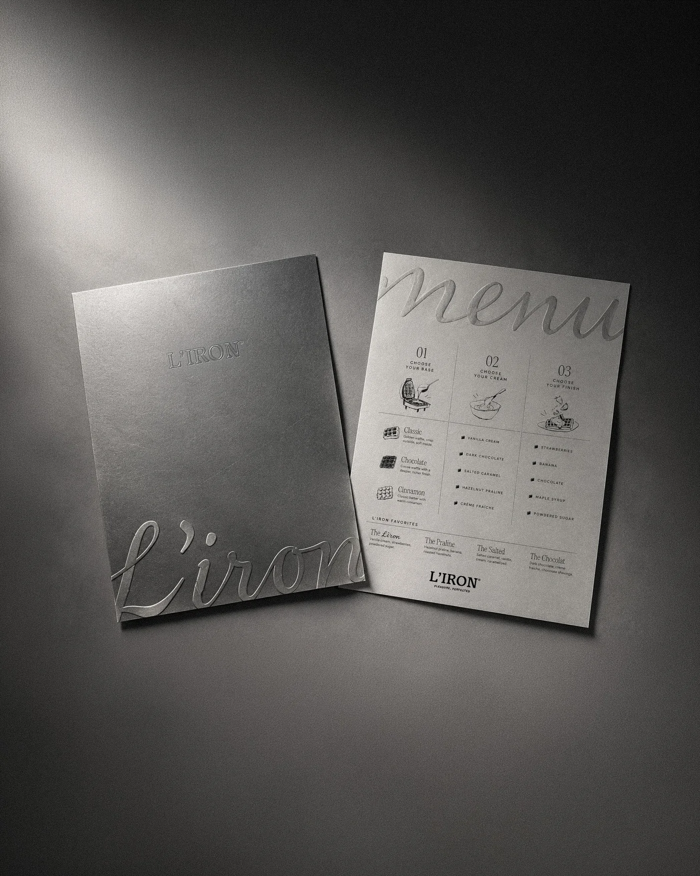
We called it the mark of craft. A waffle iron marks everything it touches, so the brand does the same: its name pressed into foil, its signature pressed into a dark menu cover, a fine grid running across the corner of the box. The line on everything is Pleasure, perfected.
Identity
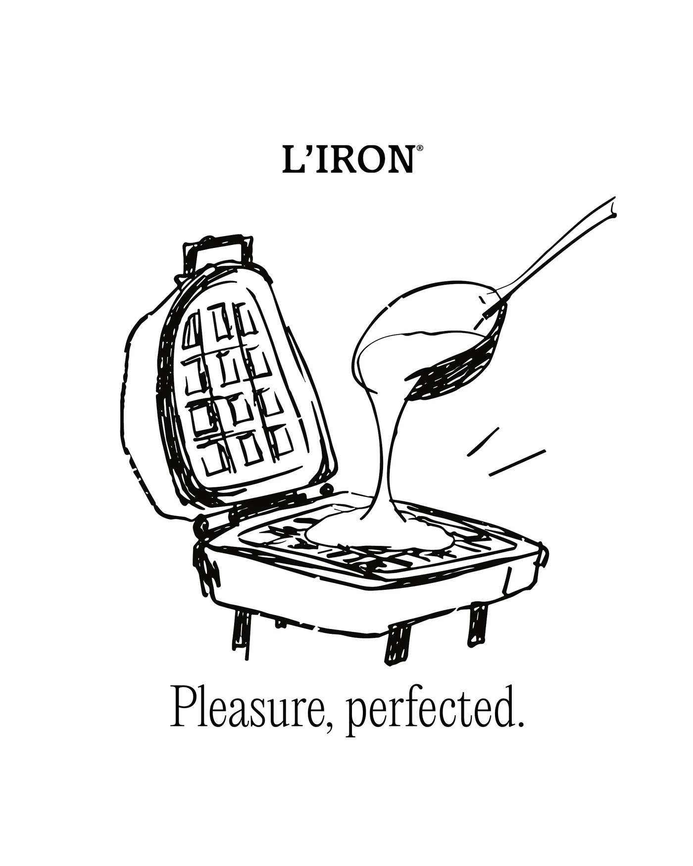
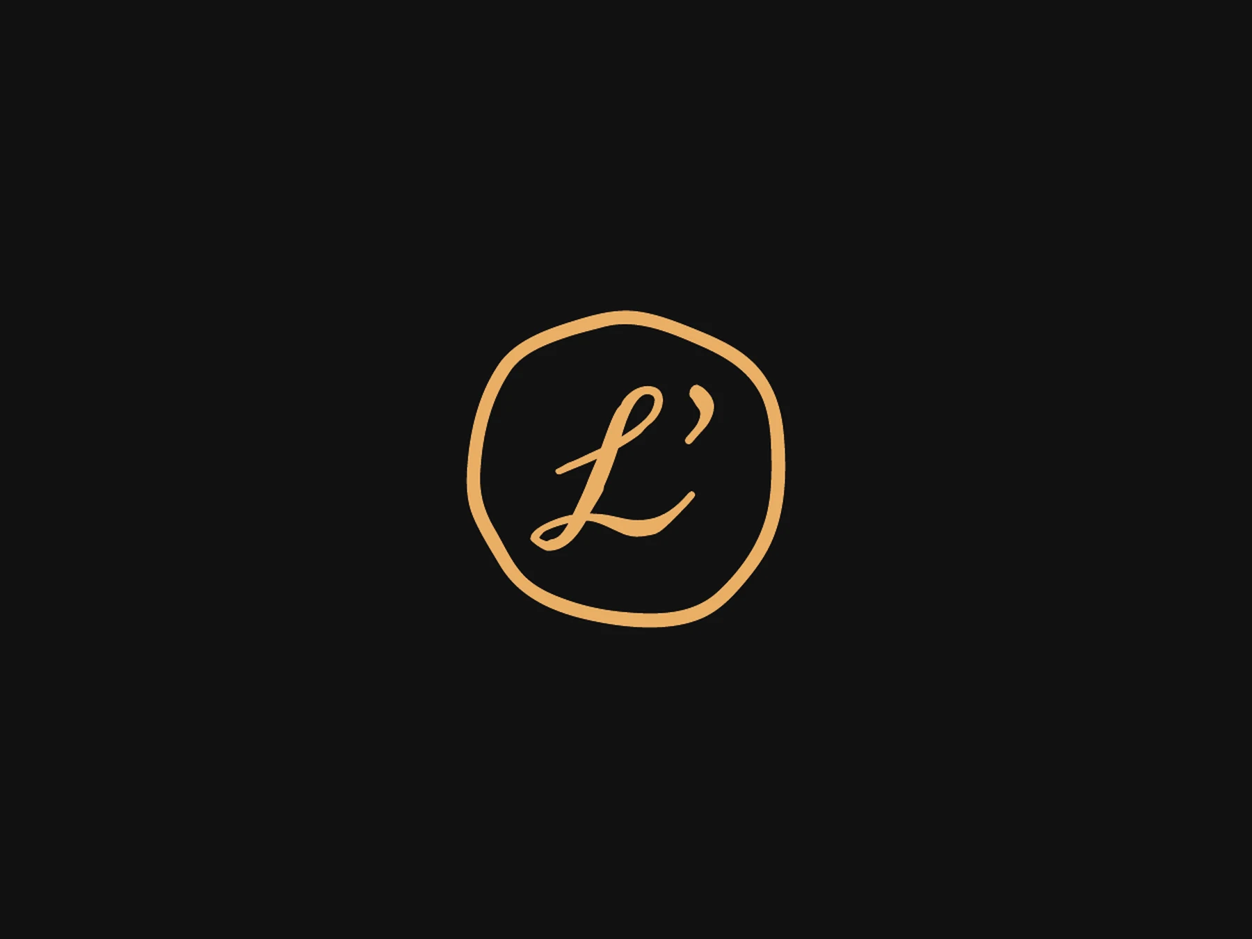
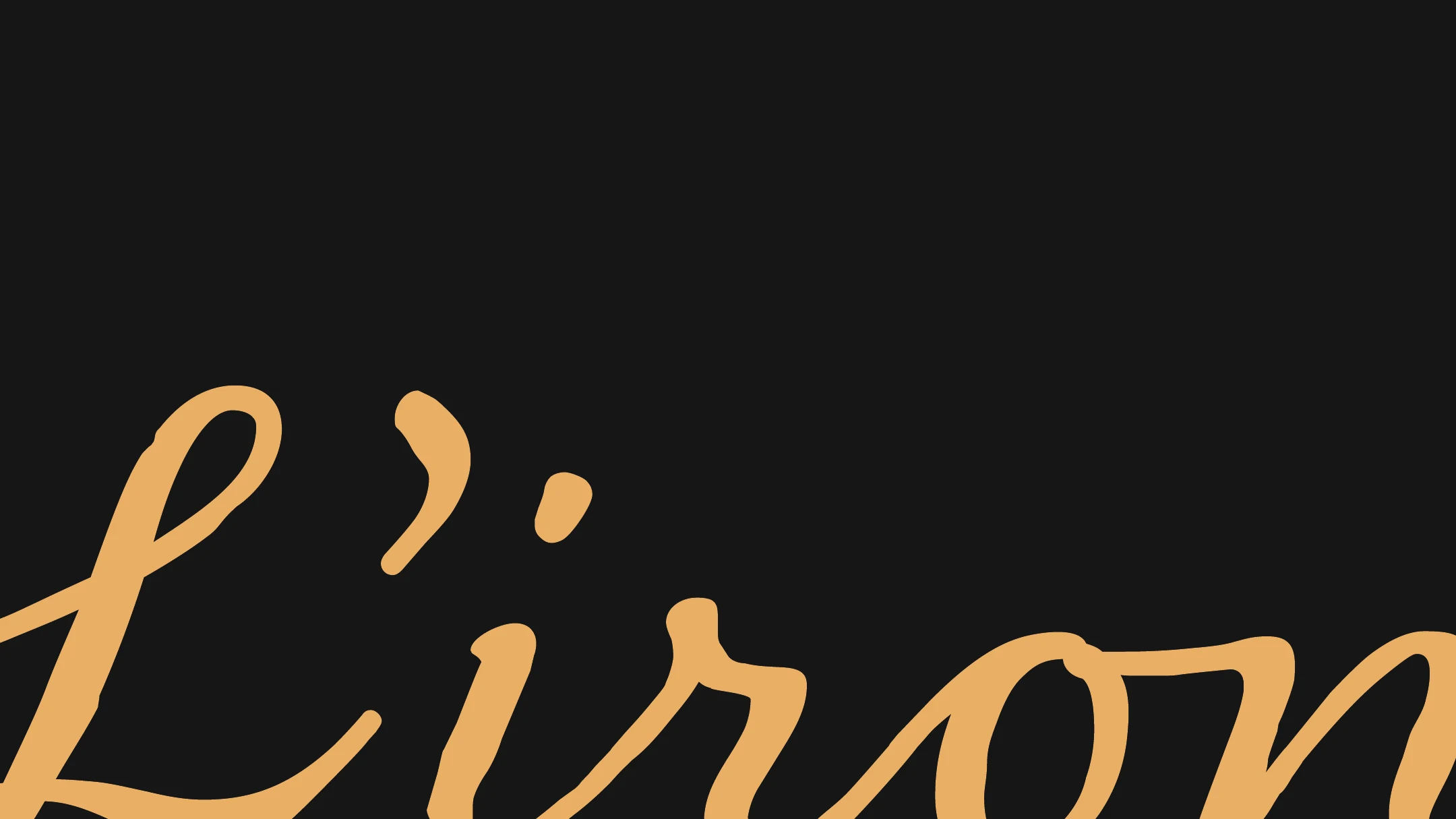
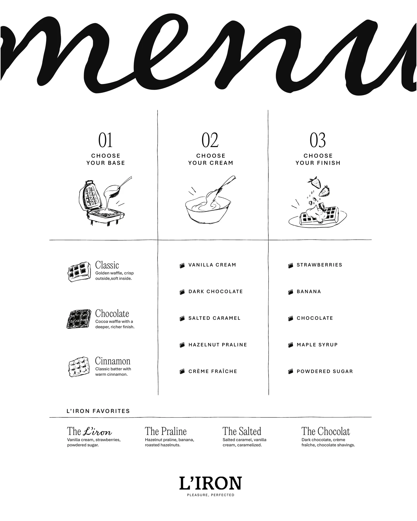
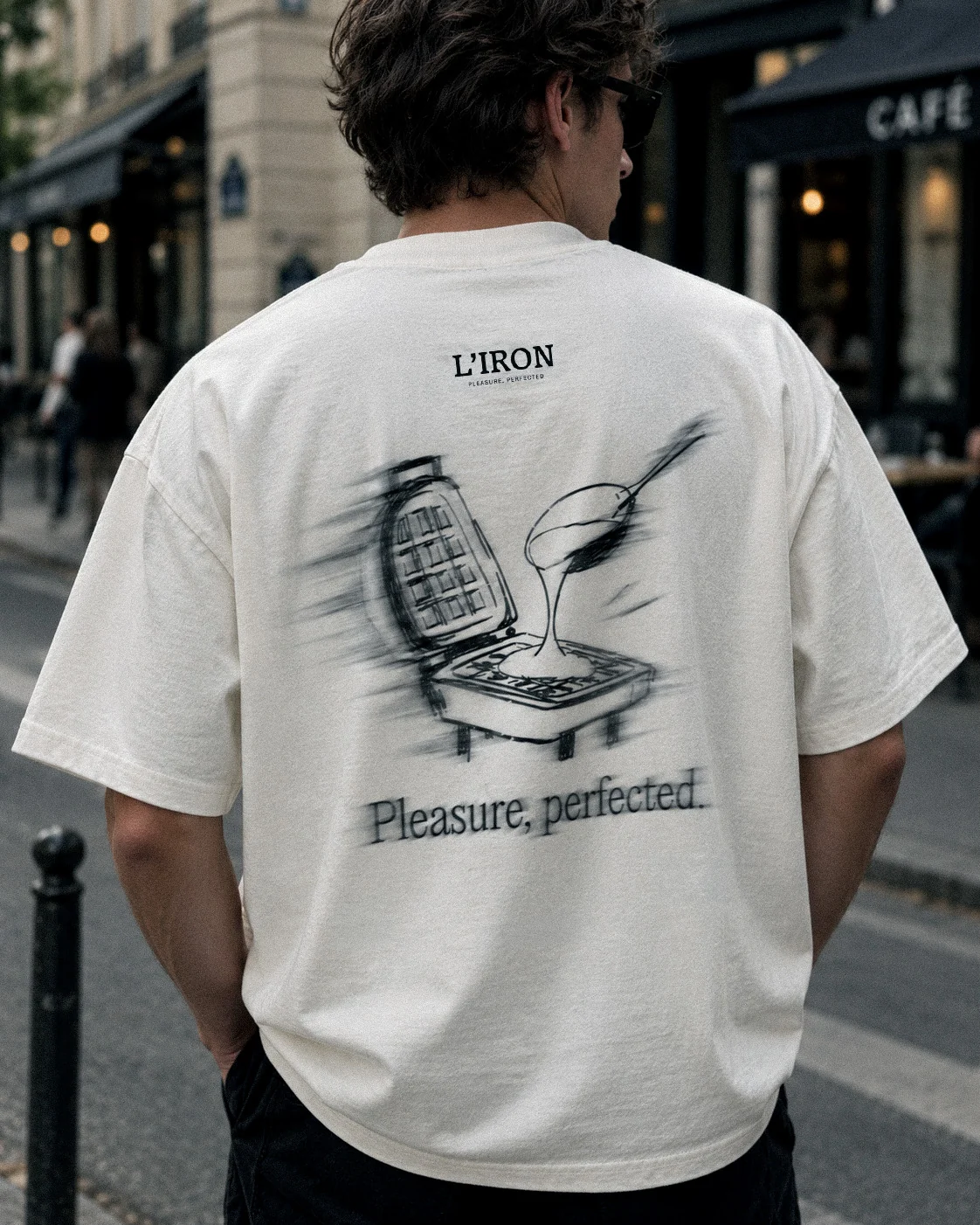
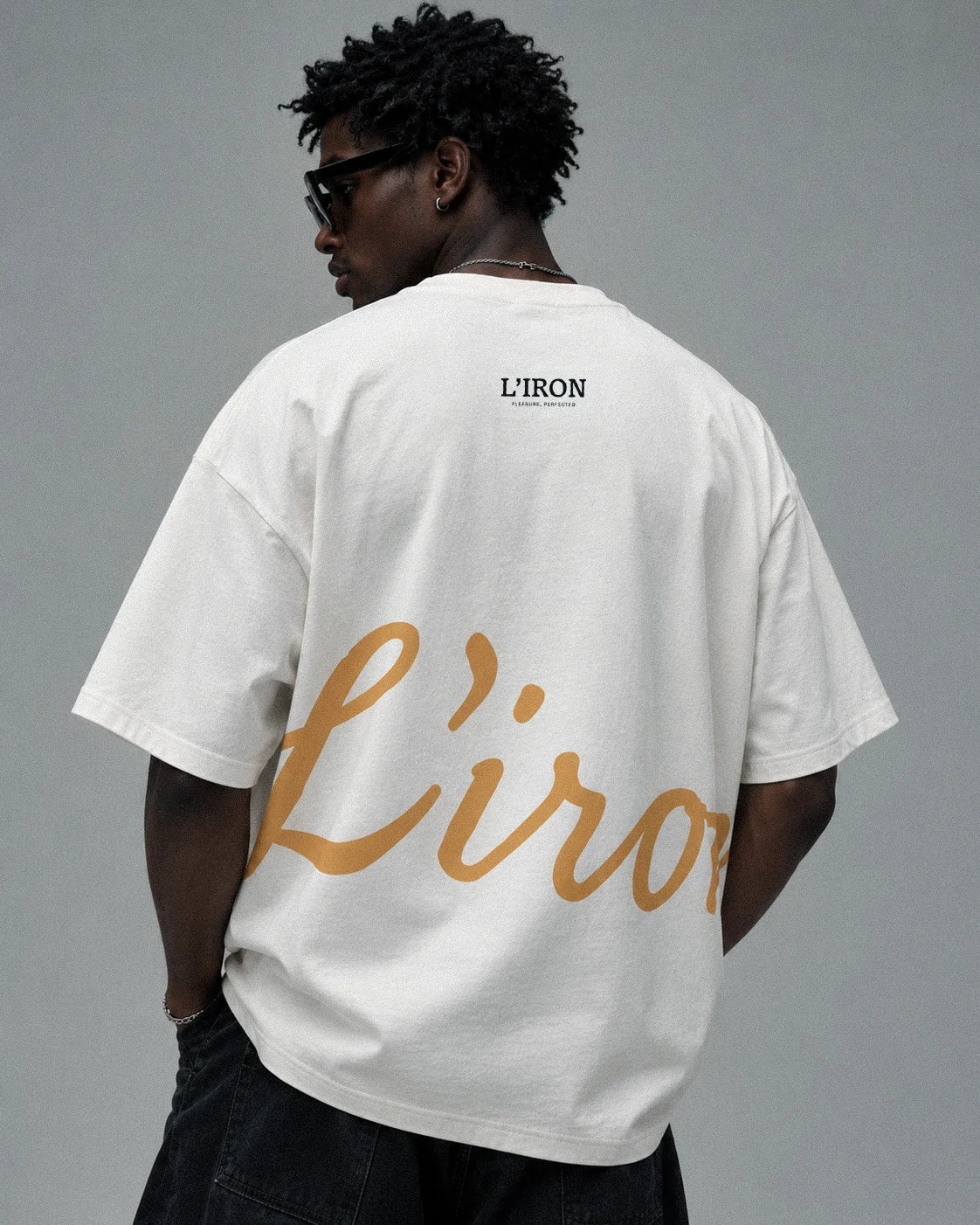
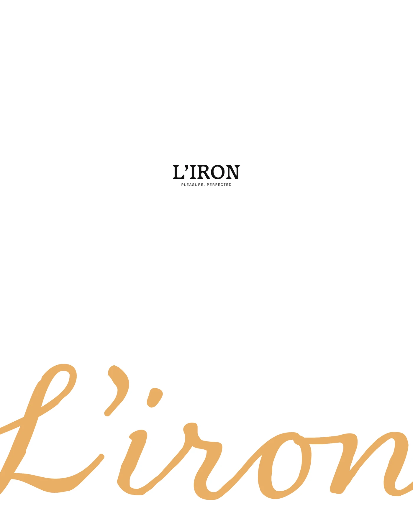
L’Iron has two signatures. The serif wordmark stands upright and formal, with Pleasure, perfected set small underneath. The amber script is warmer and runs off the edge of the page, and it shrinks into a round seal for cups and small spaces. An ink drawing of batter pouring into an open iron keeps the whole thing from taking itself too seriously.
Packaging
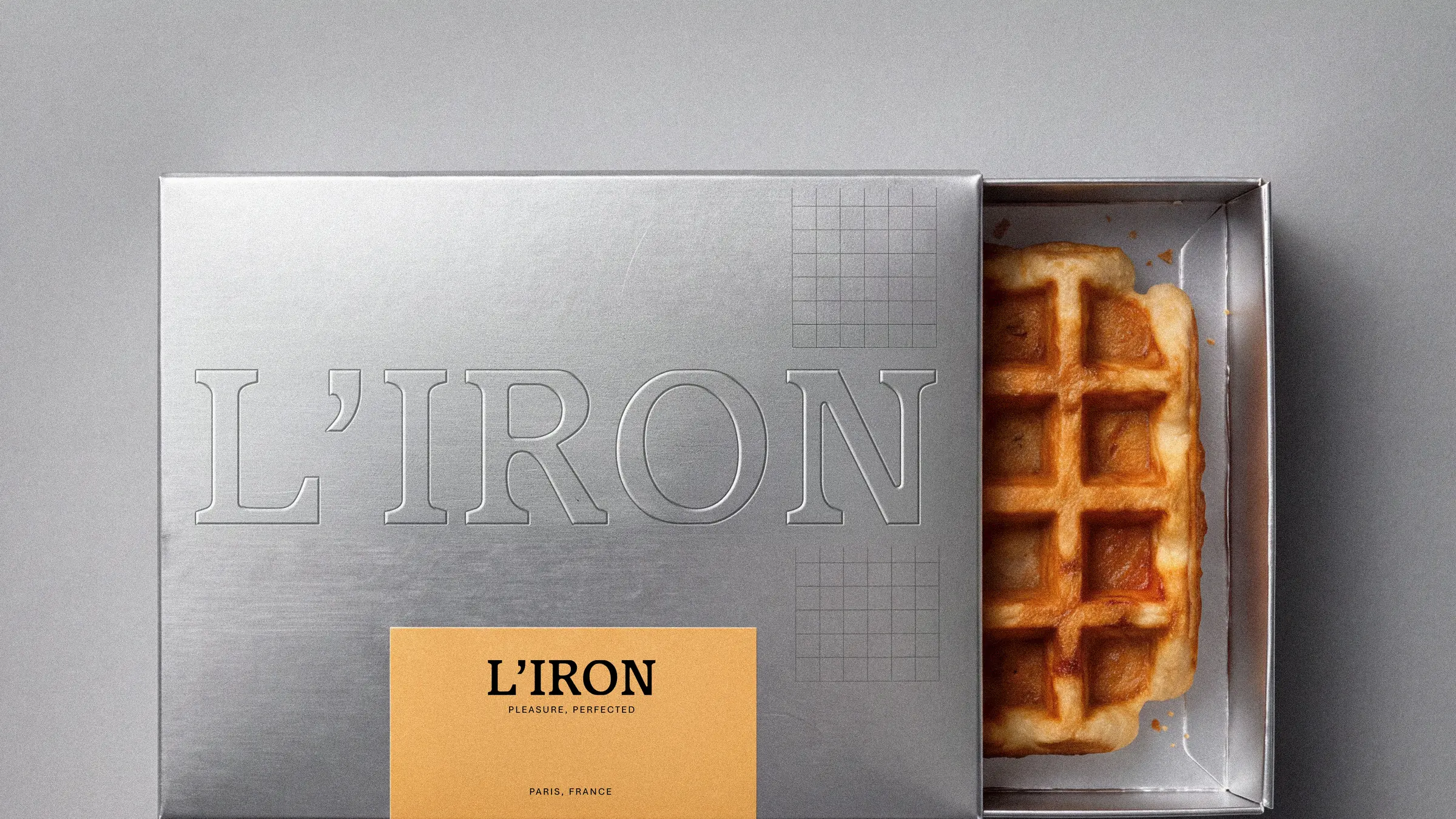
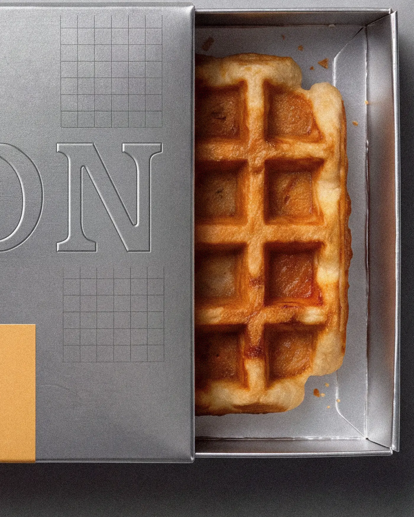
The box is folded like a block of good butter: silver, with the name embossed into the foil and one amber label. It slides open like a drawer, and the waffle sits inside.
Colour
Amber is the one warm note against black, white and silver, in the same family as the waffle in the box.
In the world
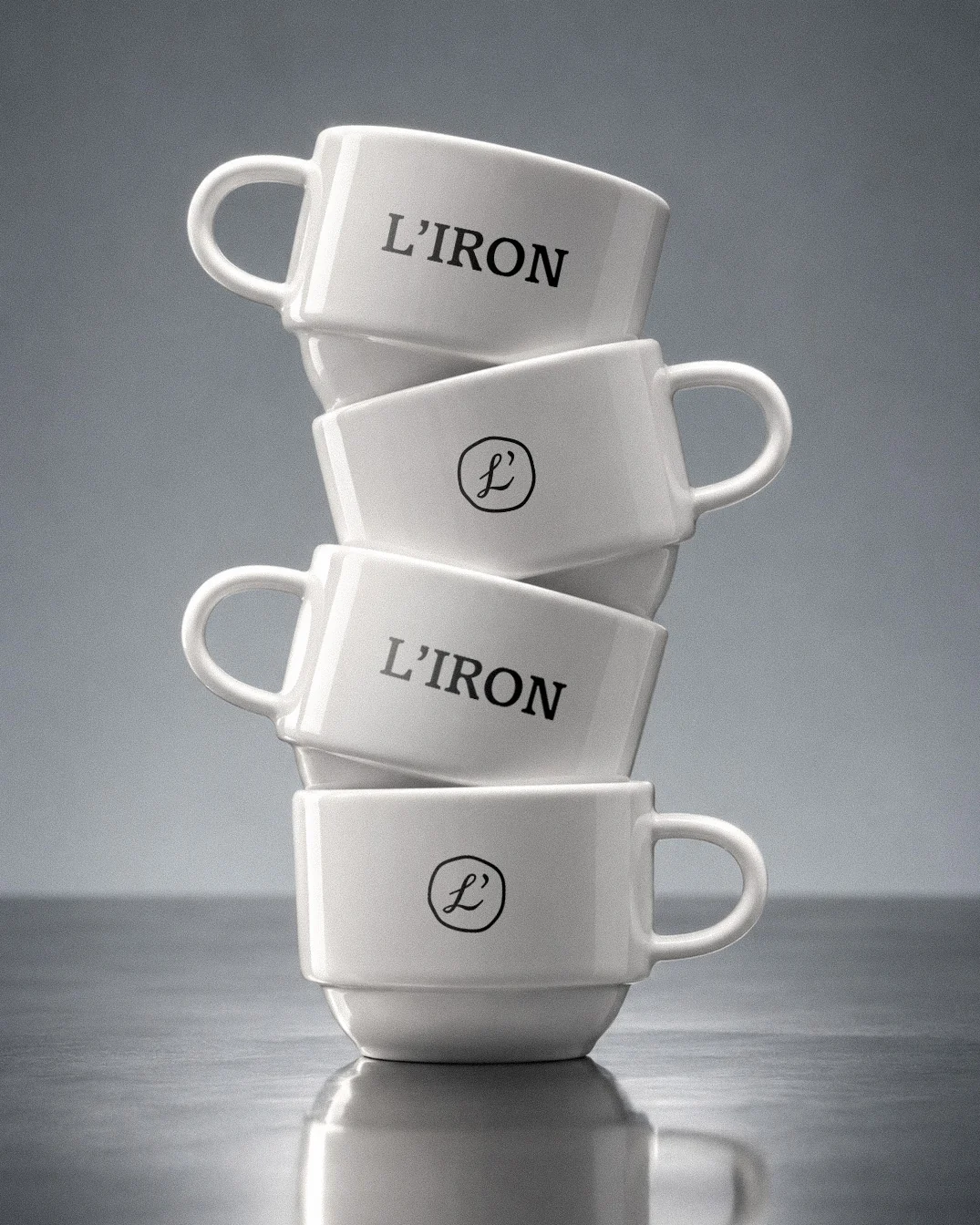
L’Iron also lives away from the table: stacked cups with the wordmark and the seal, a T-shirt with the ink drawing, another with the script running across the back.
Have something in mind? Let’s make it a little unexpected.
Good things start with a conversation.
Meet us in the patio