The challenge
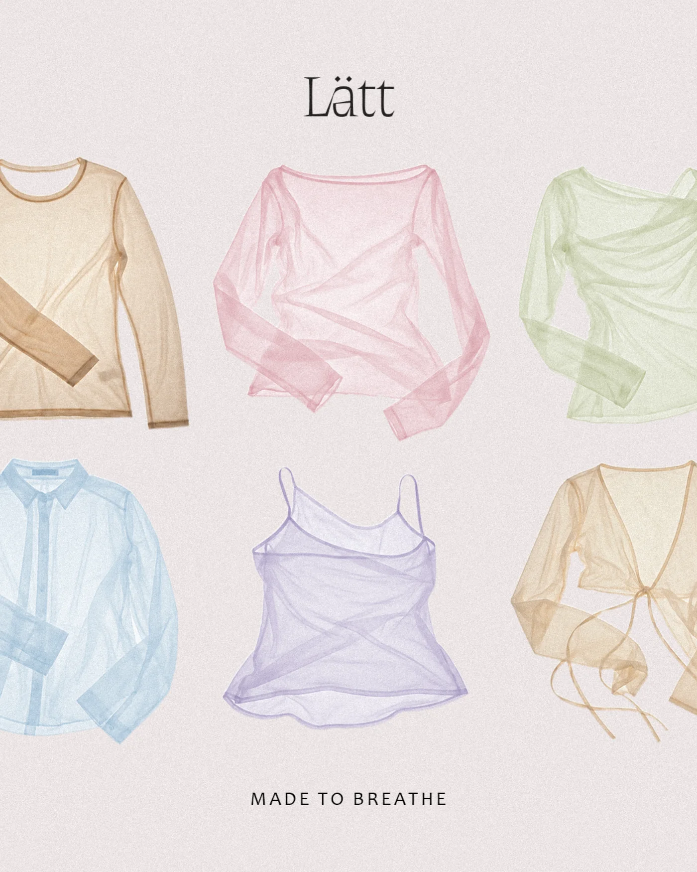
Tailoring usually holds the body in place. Lätt holds it softly: delicate sheer knits, flowing silks and soft-structured suiting, cut as relaxed staples for everyday luxury. It’s Scandi tailoring with a light, romantic touch.
Softness comes easily to clothes like these. The fabric says delicate, tactile and softened before anyone designs a thing. What it can’t say alone is premium, and a brand that only whispers is easy to walk past. Lätt needed a quiet voice that people would remember.
The idea
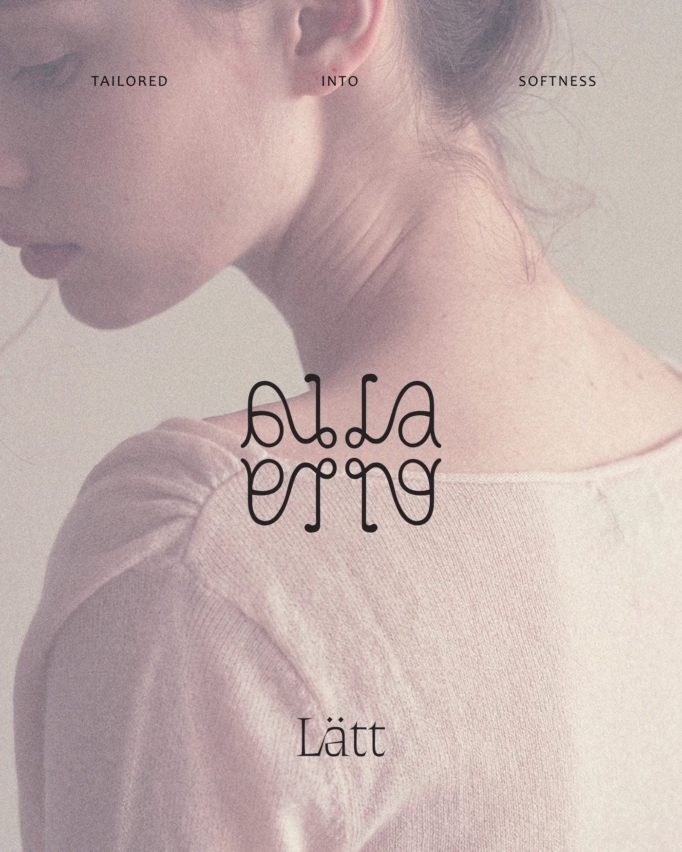
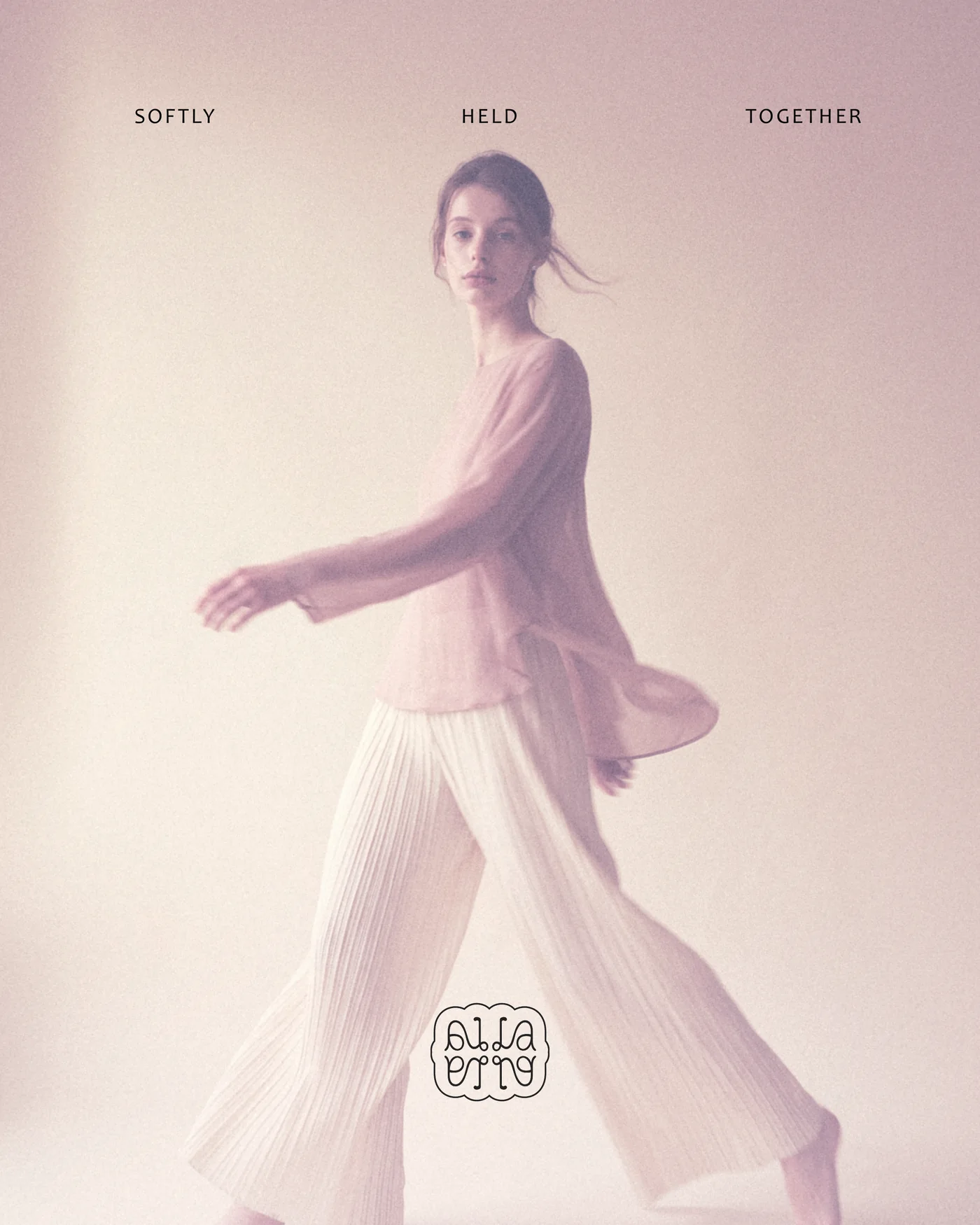
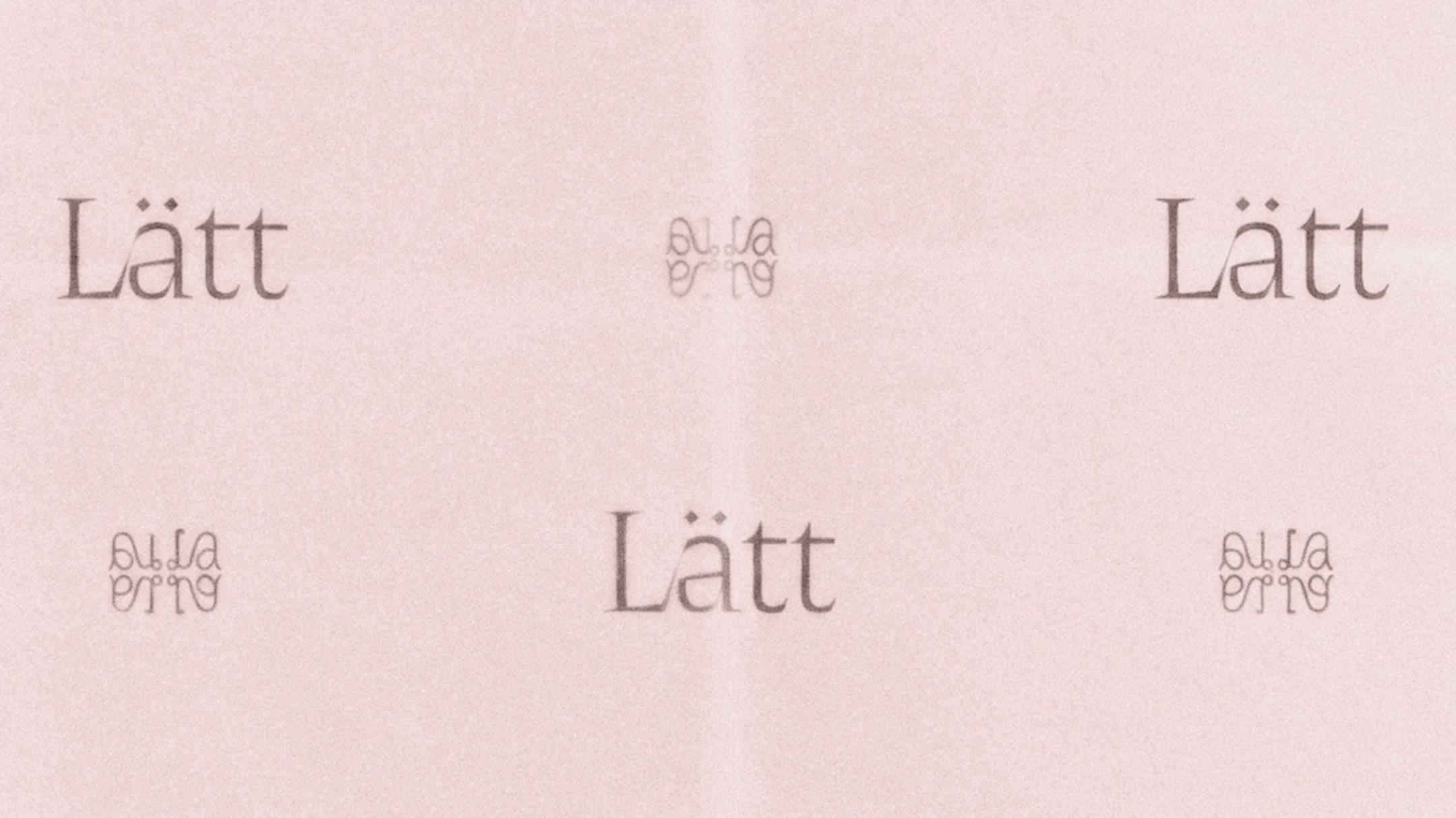
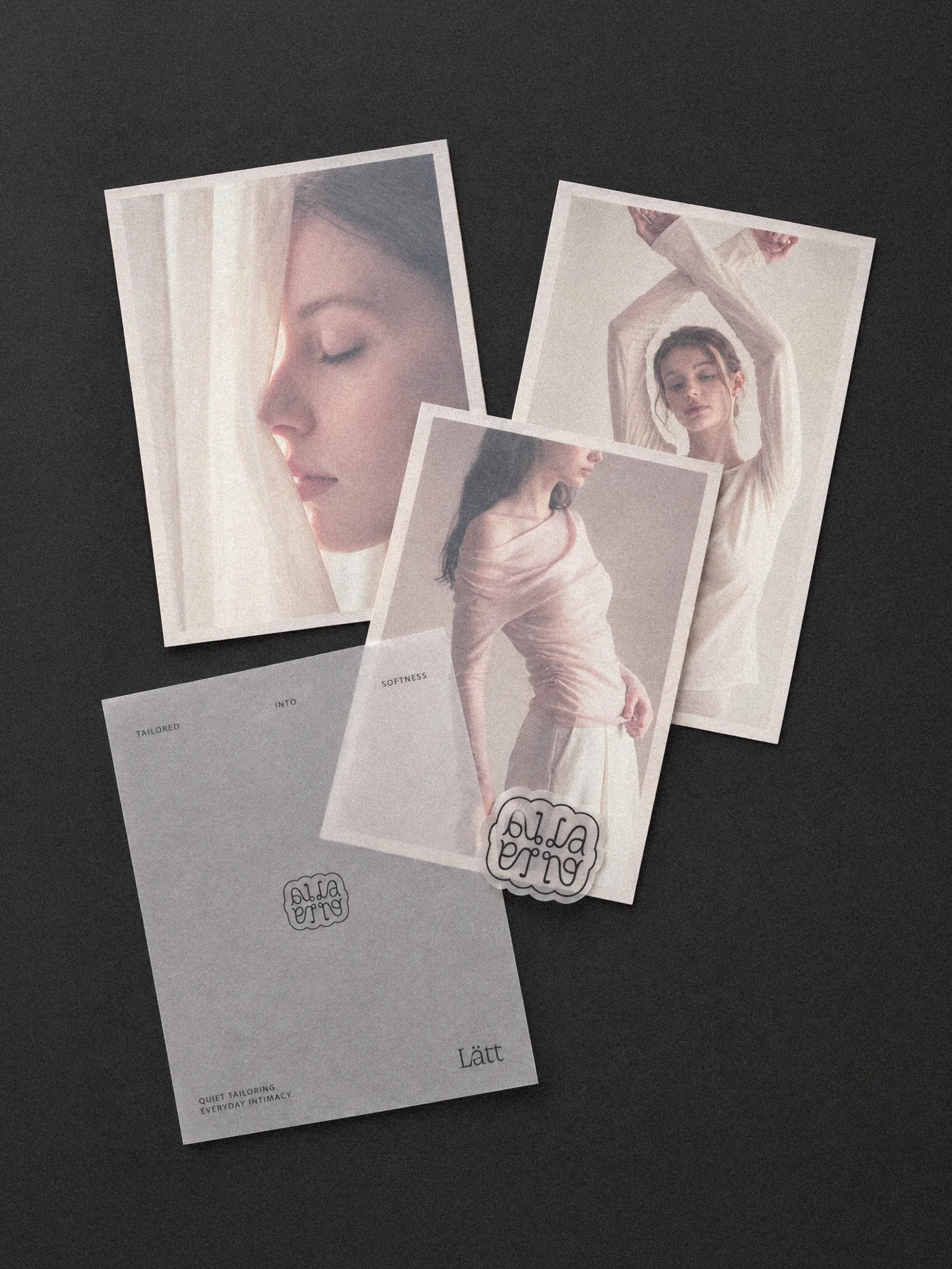
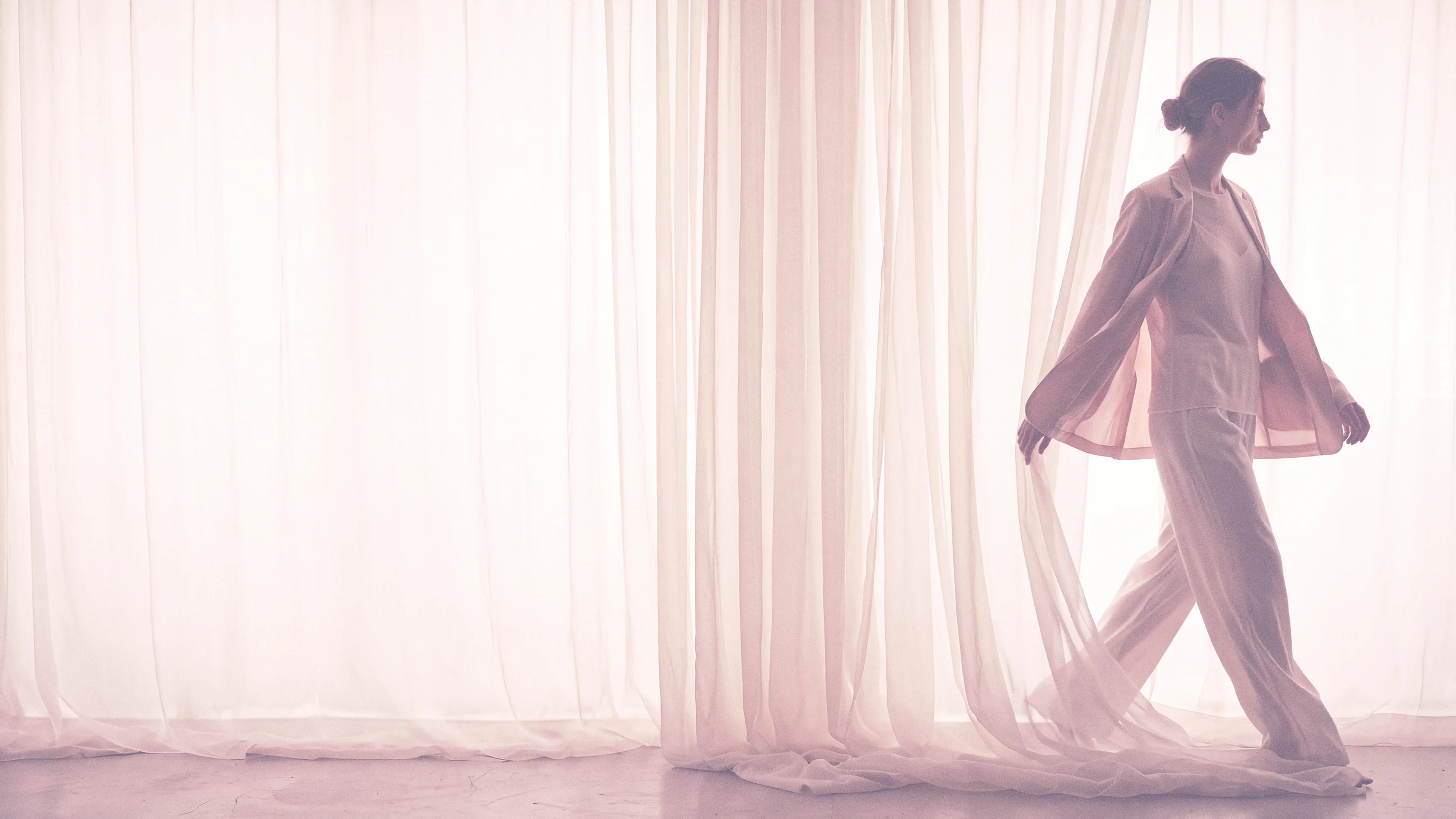
Lätt is Swedish for light, and we kept coming back to one picture: window light passing through something thin and landing on skin. A curtain, a length of organza and a sheer sleeve all do that job in the photography. The print does it too, with tissue paper laid over the cover.

Identity
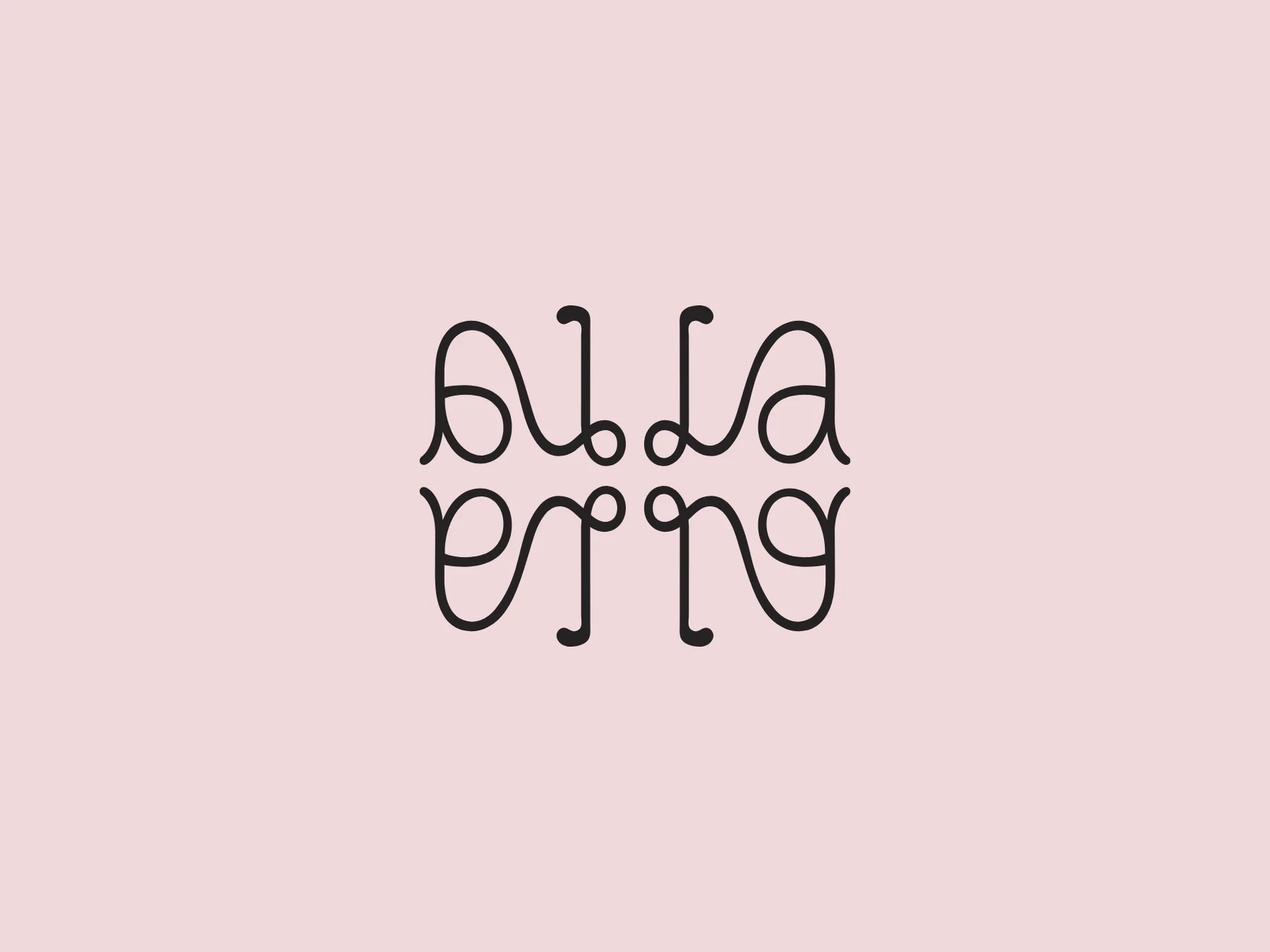
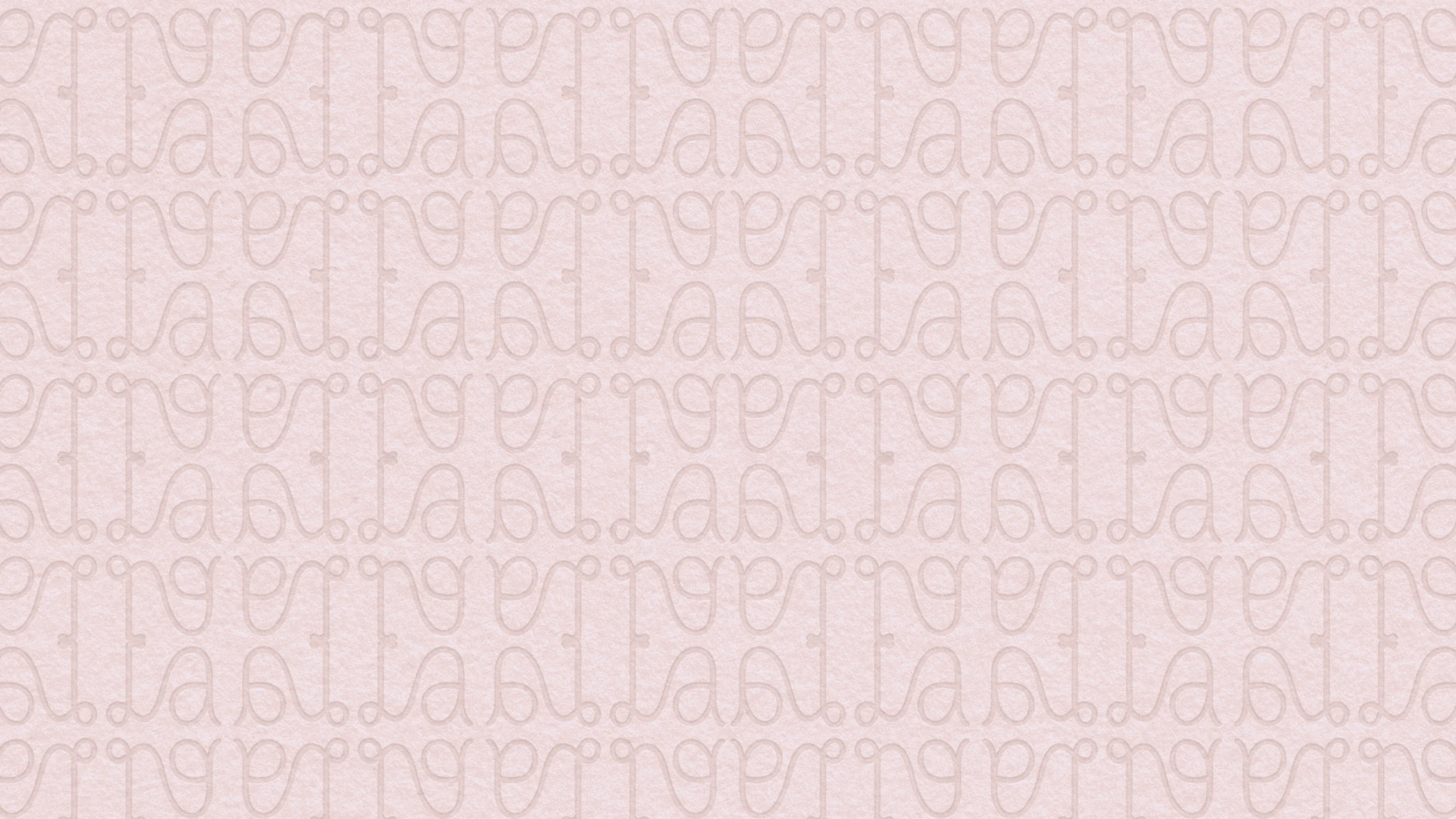
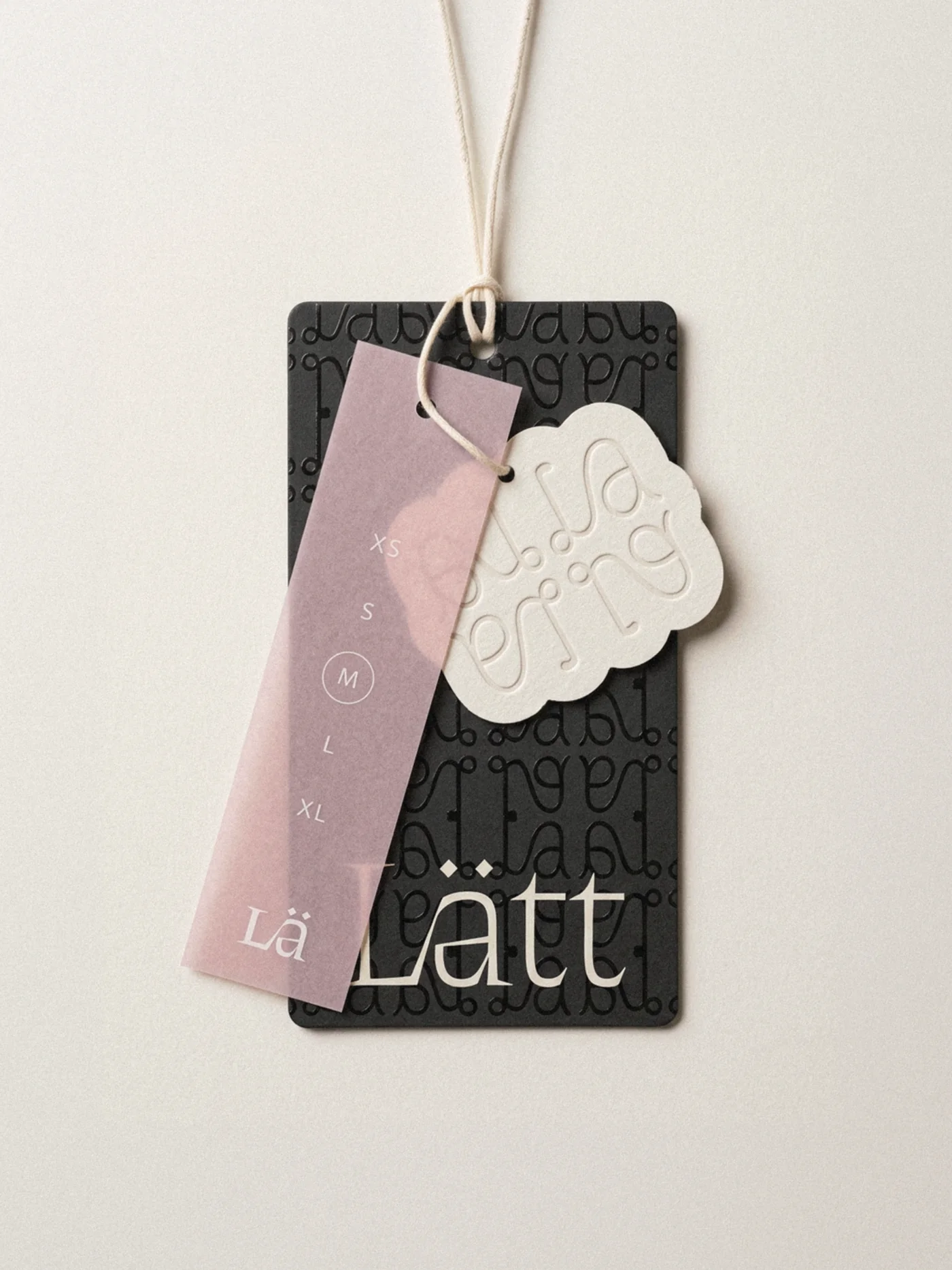
The symbol is a single line. It loops through an L and an a, then mirrors across both axes, the way a pattern piece is cut on the fold. It runs large on posters and small on business cards, gets pressed blind into paper and is cut out as a swing tag.
Typography
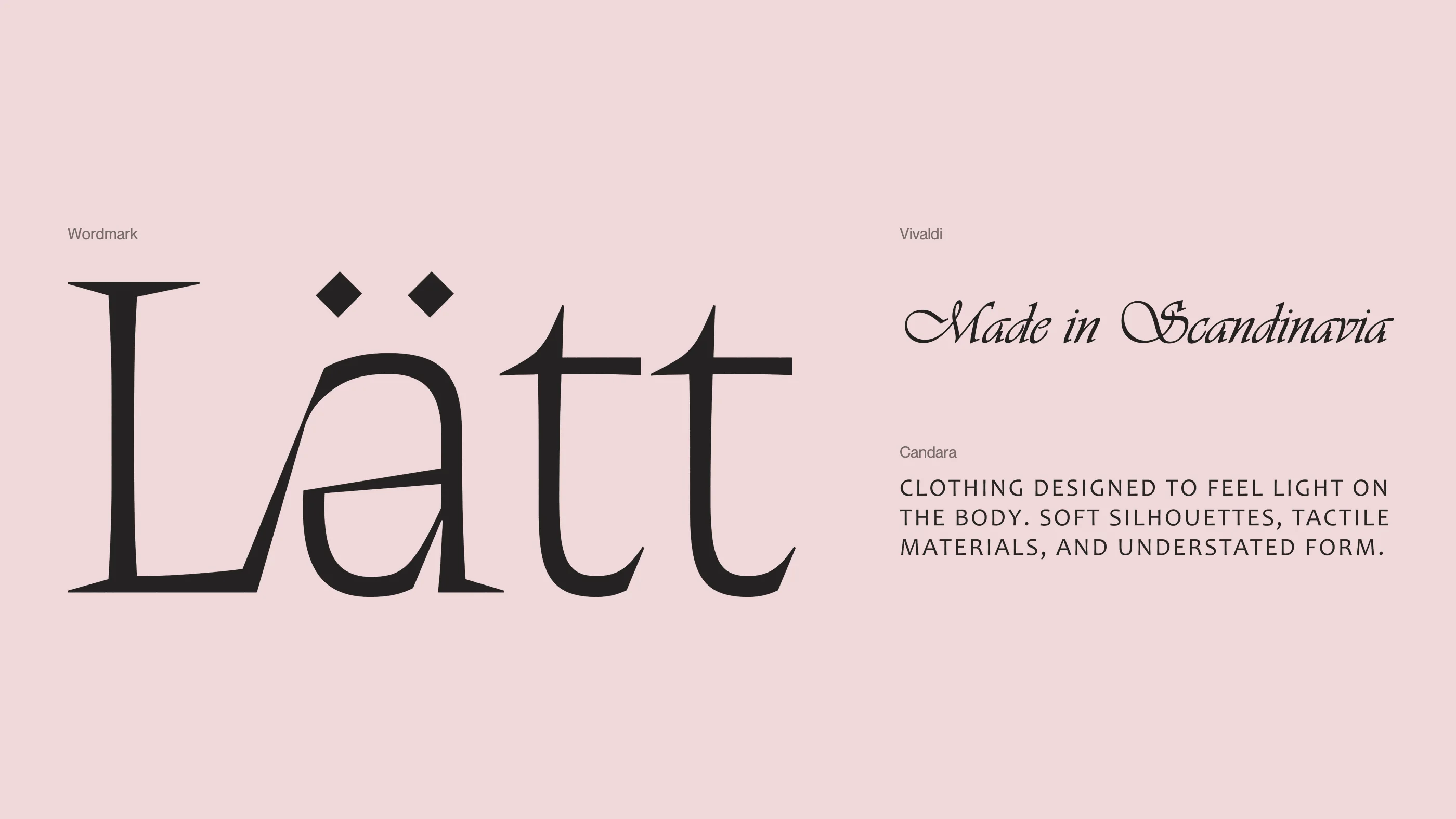
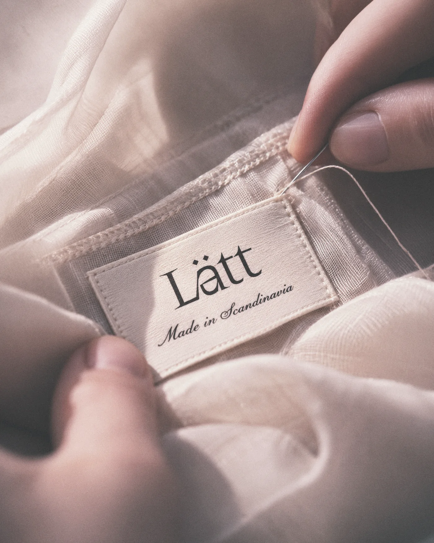
The wordmark carries most of the personality, with sharp serifs and two diamonds sitting where the dots of the ä would be. Around it, Candara in wide capitals keeps the small print calm. Vivaldi turns up only for “Made in Scandinavia”, the one flourish we let ourselves have.
Colour
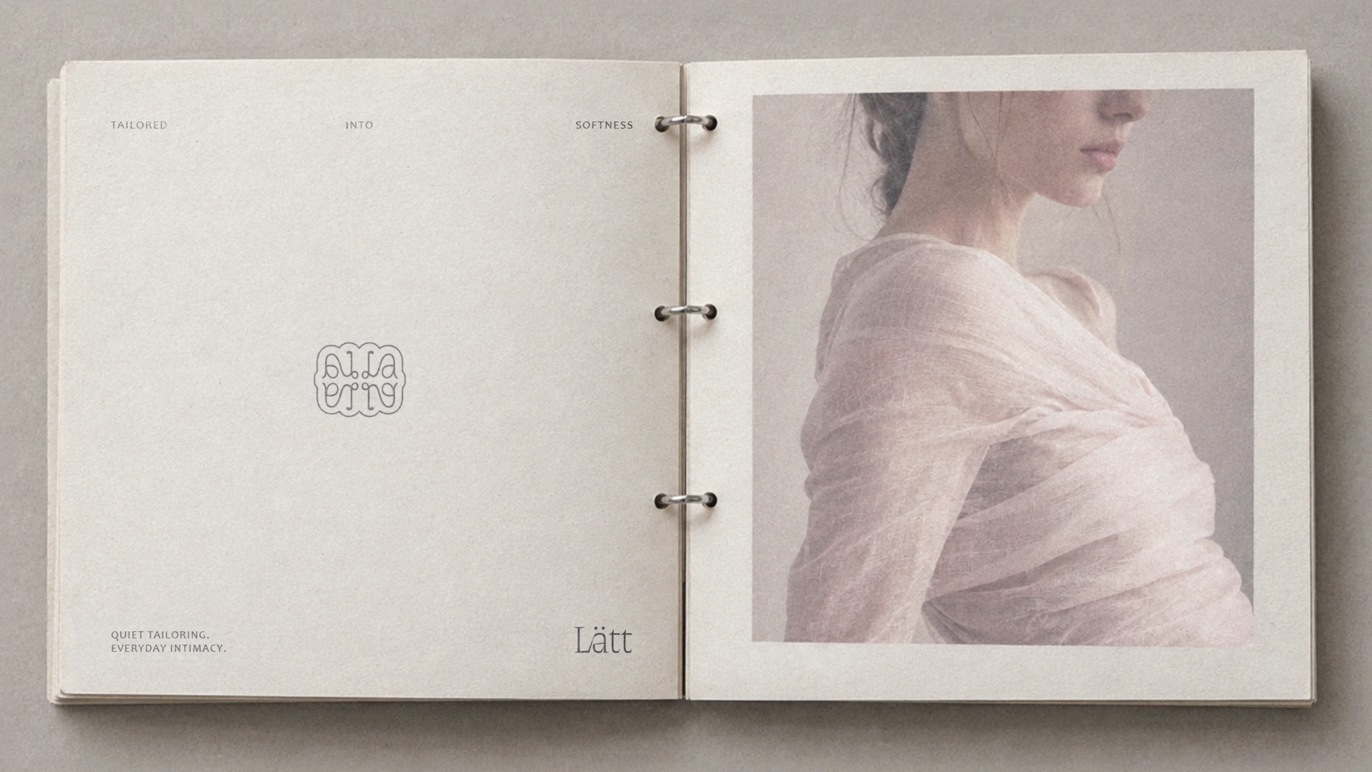
Ink, Mist and Stone hold the system together. The photography stays off true black. A film-style grade lifts the shadows until the darkest tones turn a soft mauve, so the pictures feel as light as the clothes.
In the world
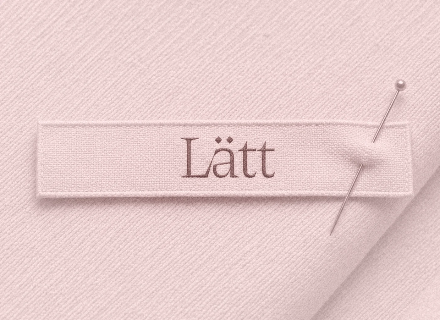
A customer would meet Lätt through things they can hold: a woven label, a swing tag, tissue paper, a ring-bound lookbook. Most of it is paper, which suited the name.
Concept project. Brief by @designerbriefs.
Have something in mind? Let’s make it a little unexpected.
Good things start with a conversation.
Meet us in the patio